Introduction
Do you know, how to create map chart in Excel?
if you don’t know, you are at the right place to learn for creating map chart in Excel easily. When we click on the Area button the chart will automatically changed as per the location and the stats will be also automatically change. So you can watch the below video to learn how to dynamic create map chart in excel is easy.

Command Used
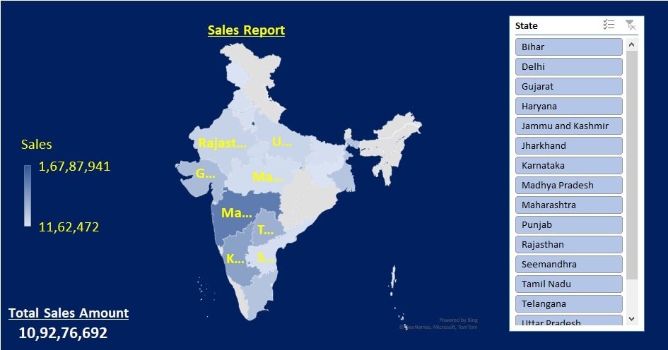
First of all, you have to select the data then convert your data into a table format. We have convert the data in table because table helps us to add new data automatically in chat also with the help of table we can create Slicer buttons easily, that’s why I converting data into table. After selecting all the data click on Insert button and click on Maps option in the chart area.
Now the map chart Will be created. After that you have to create Slicer button so select all data again and click on insert button then click on slicer option. Now it will ask for what slicer you want to create, so we will select the State option. Create a slicer buttons after clicking ok. The slicer of a state’s name will be created.
All the name will be converted into clicking button and now when I click on any button the chart will automatically update as per the data and it shows region-wise report as you like. Now you can customize more its designing. Kindly watch the below video and you will learn the customization of map chart easily.
Also Read: Sales Analysis Report in Excel
Purpose
Map chart in Excel is a really useful tool. If we use Map Chart to make our Report it will be very impressive. You can impress your boss or your client. When you will click on the slicer button the chart will be automatically updated with the respective data. This automation will create an amazing impression in the mind of your boss or your client, to whom you want to show the report it is very easy useful tool to presenting the report.
Download Map Sales Chart Practice File in Excel below
Video Tutorial


