A presentation can look mismatched even when every slide uses the same template. One image has dramatic shadows, another uses pastel illustrations, and a third leaves no room for a heading. Replacing these pictures individually often creates more inconsistencies. Decide what the visuals need to explain and which design choices should remain unchanged across the deck.
Stock photos can work for familiar subjects, but matching their colors, framing, and backgrounds across several slides can be difficult. This guide explains how to plan a small visual system, write reusable image briefs, and check the results inside your presentation. When a suitable illustration is missing, an image-generation route such as Nano Banana Pro can provide a draft from a text description; The final layout and quality checks still belong to you.

Decide Which Slides Actually Need Images
Start with the outline, not an image search. Write the message of each slide in one sentence, then ask what a picture would add. A process slide may need a diagram. A comparison may need two matched illustrations. A slide reporting quarterly revenue needs a chart built from verified figures, not an invented picture of business growth.
Create a short visual inventory with three categories:
- Evidence: authentic photographs, screenshots, and charts that support factual claims.
- Explanation: illustrations that clarify a situation, concept, or relationship.
- Decoration: backgrounds or accent images that establish a mood without carrying essential information.
Use generated artwork mainly for explanatory or decorative roles. Do not substitute a synthetic office scene for a photograph of your actual workplace. If the slide requires precise equipment details, product features, or interface instructions, use an authentic source and check that it matches the subject being discussed. Label conceptual imagery when viewers could reasonably mistake it for documentary evidence.
Build a Visual Brief Before Creating Anything
Choose a few fixed characteristics for the whole deck: visual style, background treatment, accent colors, and subject placement. For example, a staff training presentation might use flat illustrations, pale backgrounds, navy outlines, and a single orange accent. Record these choices in a brief you can reuse. Avoid instructions like “make it professional,” which leave most design decisions unspecified.
Next, define the space the image will occupy. A wide slide does not necessarily need a full-slide picture. If text takes the left half, the illustration may need a narrower frame on the right. Sketch that arrangement first, then request artwork suited to the image area. Otherwise, cropping may remove the detail that makes the illustration useful.
Keep essential wording outside the image whenever possible. Add headings, labels, and figures as editable slide text so you can correct them without regenerating artwork. Likewise, build an exact three-step process with shapes and connectors if the sequence matters. An illustration can show the setting, while the slide editor handles the information that must remain accurate and easy to update.
Generate and Refine One Representative Image
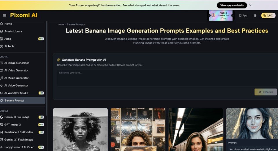
Choose one representative slide. For cybersecurity training, illustrate an employee reviewing an unexpected email. When stock imagery does not fit your planned composition, use Nano Banana Pro as an image-generation starting point: provide the scene, style, colors, and required empty space in a text prompt. Review whether the draft communicates the intended situation before placing it in the deck.
A sample prompt:
Create a flat editorial illustration for a workplace cybersecurity presentation. Show one employee at a desk looking cautiously at a laptop. Use navy outlines, pale gray backgrounds, and restrained orange accents. Place the employee on the right and leave the left side uncluttered for a heading. Do not include readable text, logos, or numerical data.
Judge the draft against the brief, not against how impressive it looks in isolation. Does the cautious posture read clearly? Is the laptop recognizable? Is the empty area actually usable? If the composition works but the colors do not, request only a color adjustment. If the scene communicates the wrong action, revise the subject description instead of adding more style adjectives.
Use the approved draft as a visual reference for later images where your chosen workflow supports reference inputs. Describe each new scene separately while repeating the fixed style instructions. Reference-based editing is an available image workflow, but it does not remove the need to inspect every result for changes in objects, composition, or visual style.
Check Consistency Inside the Slide Deck
Place the first image into the actual template before creating the remaining set. A picture may compete with the title, disappear against the background, or become unreadable after cropping. Test it in presentation view, where you can judge the relationship between the image and the slide’s message rather than focusing on isolated details.
For each image, run the consistency check:
- Framing: Are comparable subjects shown at similar sizes and viewing angles?
- Color: Do the background and accents fit the established palette?
- Detail: Does one picture look noticeably busier or more realistic than the others?
- Meaning: Can you explain why the picture belongs on that particular slide?
Review related slides together, especially before-and-after examples or paired comparisons. Unintentional differences can confuse the comparison. For instance, if one illustration shows a cluttered desk and another changes both the desk and the employee’s expression, viewers may not know which change matters. Keep unrelated features stable and make the intended difference explicit through the slide heading or caption.
Finish with a Deck-Level Review
Once the images are placed, review the presentation from beginning to end without opening the generation tool. Check that each visual supports its slide, related images look like part of the same set, and no essential wording has become embedded in artwork you cannot easily edit.
Replace questionable factual imagery with authentic evidence. Simplify scenes that compete with the message. Keep the visual brief and approved examples alongside the presentation so later additions have a clear reference. A coherent deck begins with deliberate choices about meaning, placement, and style, followed by careful review of the finished slides.
Join Our Telegram Group

Join Our WhatsApp Group